Interior Colour Trend Predictions for 2024 and How To Use Them

2024 is on its way and brings with it a whole new set of colour trends to decorate your home! We love using colour to update our homes as it’s such a quick and simple fix that can be budget friendly too, with a simple change up of soft furnishing like cushions or small accessories, or a lick of paint on the walls.
Breaking away from the muted tones of yesteryears, this year’s colour choices are bold, diverse, and destined to transform your living spaces into gorgeous new spaces. We’ve got a kaleidoscope of colours to captivate you this year!
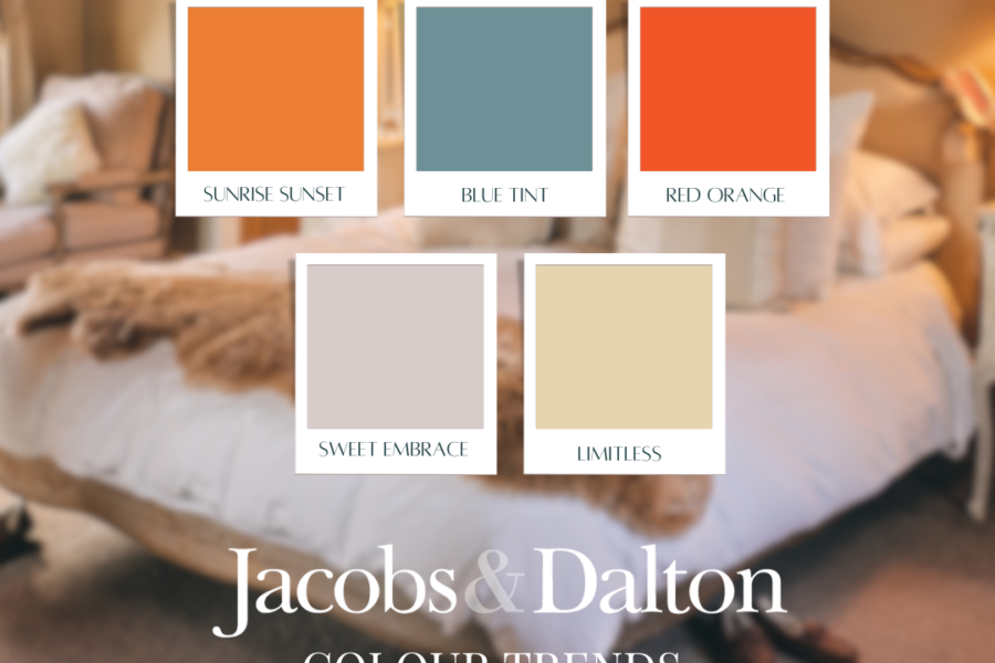
Sunrise, Sunset
In contrast to the muted pale shades of the natural world that we’ve seen in recent years, Pantone’s bold Sun Orange along with their Peach Fuzz choice for colour of the year in 2024 is setting the scene for a vast range of stunning sunrise and sunset shades to shine bright. These can be best described as vibrant and energising, but can also be toned down to shades like apricot and salmon to suit different areas in your home.
We love that the hues of sunrise and sunset can work so perfectly throughout our homes depending on the orientation of the rooms and the way the light hits them. You can use fiery red and turmeric gold to brighten and cheer a colder north facing room, or use pale sorbet shades to complement a warmer south facing room.
Blue Tints
C2’s Thermal, Sherwin-William’s Upward, Benjamin Moore’s Blue Nova, Valspar’s Renew Blue, Minwax’s Bay Blue and Krylon’s Bluebird. We see a theme! Paint companies around the world have, in the vast majority, chosen vivid hues of blue as their colour of 2024. Rather than the many shades of grey in previous years, blue is our cool tone of the year.
Whether moody and dusky, bold and vibrant, or clean and tranquil, blue is having an absolute moment. It pairs beautifully with the sunrise and sunset shades above in interiors to contrast and enhance them.
Sweet Embrace
In the post-Barbiecore world, we’re looking for more grown up shades of pink instead of the bubblegum brights that reigned supreme. Sweet Embrace has been named as 2024’s soft blush shade that is reassuring, calming and soothing. This delicate hue offers a subtle yet impactful way to introduce a touch of warmth and femininity to interior spaces without overwhelming the senses.
Whether applied as a wall colour, as an entire furniture piece, or in details of soft furnishings like cushions and throws, Sweet Embrace adds a nuanced layer to interior design. Its muted tones make it versatile, pairing seamlessly with a range of neutrals, earthy tones, or even contrasting against bold, dark accents for a contemporary edge.
Warm Neutrals
Every year needs a good neutral shade, and this time around, it’s official: grey is cancelled! We began heading towards warmer neutrals again in 2021 with warm greige which was grounding and reassuring after turbulent times. In 2024, the move towards warmth has been secured and we’ll see those gorgeous yellow, brown and gold undertones coming through in neutral shades.
Picture the dappled shades of a wheatfield in the summer, the crust of freshly baked loaf of bread, or the golden hour of sunset. A perfect example of this is Glidden’s choice for colour of 2024, Limitless, a smooth pale honey yellow.
These shades are perfect for home decor with a naturally cocooning feel inviting you to unwind and find solace in the soothing hues that echo the warmth of nature.
Read more on our blog